I was sitting in my living room late at 2 a.m. I was staring at my computer monitor. I had been working on something for weeks. That was the moment I saw my app for the time, in the Figma frame. It was my creation. I had put a lot of time into it.

I remember looking at a neat design with soft gradients in purple and rounded corners at the edges of buttons, and I felt so proud of what I made that I could not even fall asleep for an entire evening.
We made a productivity application. This application was really easy to use. We launched the productivity application. After three months, 41 people received the productivity application. 39 of these people who received the productivity application did not use it more than once. Thus, I realised that beautiful pictures and videos of your app being opened are not enough for its successful launch.
Do you want to avoid the costly and annoying errors I had while creating my app?Are you ready to discover some facts about making any kind of digital product like an app, a website or a web service?
Then continue reading this article.
What “Designing Digital Products” Really Means
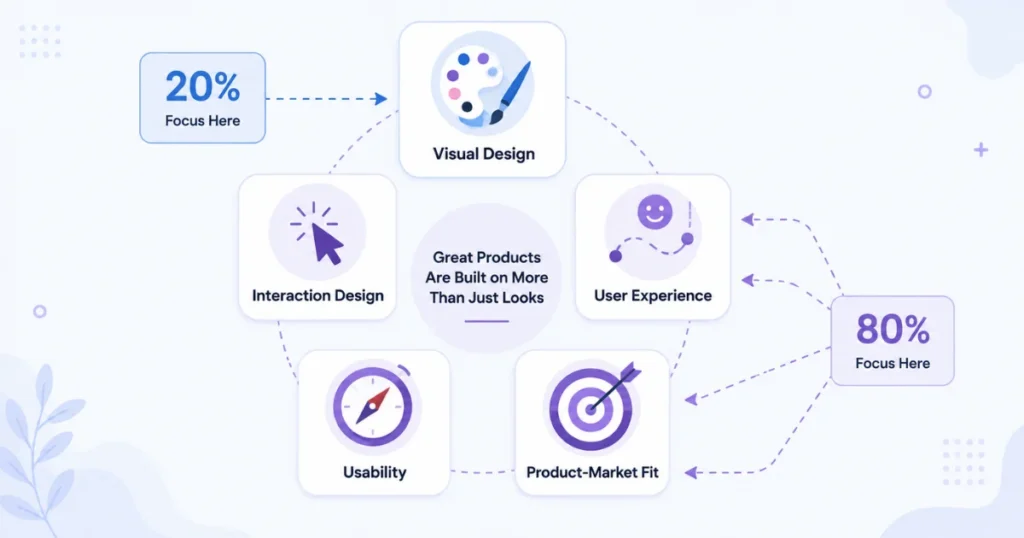
When people think about design and specifically product design, they usually imagine someone dragging colorful boxes in Figma or Sketch. This is only a small, easily visible part of the process, roughly twenty percent.
The other and much bigger part is determining the problem that needs solving, for whom this problem is critical, and how users will interact with the product in such a way that it becomes indispensable despite the existing alternatives.
Design, in the real sense, includes:
- How the product looks (visual design)
- How it behaves when someone taps or clicks (interaction design)
- How it feels to use over time (user experience)
- How easy it is to figure out without a manual (usability)
- Whether it actually solves a real problem (product-market fit basically)
These factors taken together allow creating a product that will meet or exceed customer expectations. Designing digital products is not just another stage in the product life cycle but its integral part. Without proper design thinking, a product fails at the launch because the audience is too narrow, the tool is too complex, or there is no particular need for solving the task addressed by the product. I realized that design thinking was the last thing that could be added on top of the existing solution, but now I understand that design thinking should be part of the concept that determines the product’s development strategy.
My Very First Lesson: Nobody Was Happy About the Looks Despite All the Time Spent on It
My first real lesson started when the app would not launch and I had to figure out what was going on. I made a list of questions. Send them to the people who were able to get the application to work on their devices. I also talked to a couple of them to get information.
The things people told me were pretty disappointing. A lot of people said this. They did not know what to do with the app after they opened it. They used the app. Then they just stopped because they did not know what to do next with the app.
That was a response but it was also a key lesson. It turned out that nice pictures of cats in color transitions did not make my users come back. On the other hand, they were completely confused when they opened the app.
The important part of the design, the button that tells users what to do next, was not clear which confused users instead of showing them the main thing they should do. This was the point when I understood that good design does not mean making the app look nice. Instead it is about making sure that the user knows what to do without needing someone to tell them.
Step-by-Step: How I Redesign a Digital Product Now
After that problem I have learned to change my way of doing things completely. This is how my current method looks now whether I redesign a mobile user interface, a website or a small software, as a service dashboard.
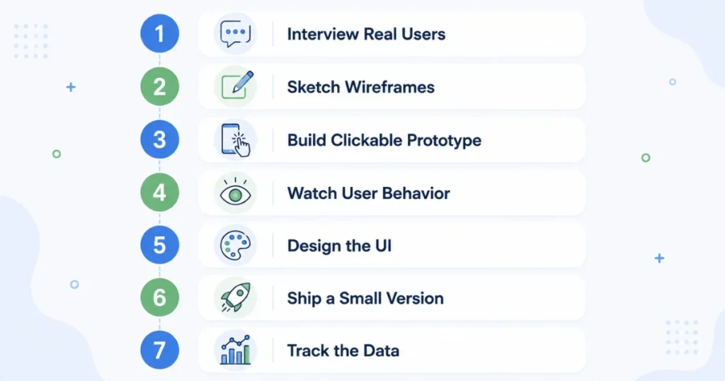
Step 1: Interview Real People Before Even Opening Figma
There is something that always tempts me to begin redesigning immediately – the feeling of being prepared. But no more! I now make a point of talking to at least 8 – 10 potential users before even opening Figma. It can be a quick Zoom meeting or a series of DMs.
I ask them the following questions:
- What’s the most annoying part of doing [task] right now?
- What have you already tried?
- What would make you actually pay for a fix?
I think you’ll be surprised by some answers that you’ll get. People will have a problem in mind that you never thought of.
Step 2: Sketch Ugly Wireframes First
Before thinking about colors and typography, I sketch my ideas using rough boxes on paper or something like Whimsical or Balsamiq. No one should fall in love with a wireframe.
Doing this step alone has helped me tremendously as it prevents wasting time designing nice-looking screens for something that makes no sense at all once you start to think about how to build it.
Step 3: Make a Clickable Prototype
Using Figma (the new cool kid on the block that everyone seems to use these days for free), I then design a prototype based on the wireframes. Nothing fancy, just enough to have clickable screens and simulate some kind of user journey.
Once the prototype is ready, I can test it with 5 real users. Not my friends that will tell me what I want to hear but real people, preferably the target audience for the product or service I am designing. I have had success with Maze, but you can also use your own Zoom link for testing purposes.
Step 4: Watch Where People Get Lost (Don’t Ask Them)
This step is really important for me. It helps me figure out the problems with my design. I do not waste my time asking users if something makes sense to them. The reason is that users will always say yes. They will say yes even if it does not make sense.
The best way to understand how users interact with my design is to watch them. I want to see where the cursor moves when users get lost. I also want to see what they click by mistake.. I want to know what they do when they give up on my design. Watching users interact with my design is very helpful. It shows me the problems with my design.
A lack of reaction is also helpful.
Step 5: Design the UI (Finally)
When the flow is confirmed I begin thinking about colors, fonts, spacing and other visual parts. In this step I try to use design systems that’re already in place rather than try to create something from scratch.
Apple’s Human Interface Guidelines and Google’s Material Design are great resources even for non-native apps and products.
Step 6: Build a Small Version and Ship It
I have given up on “building something big and perfect.” I now rather build a small version of a product and ship it as soon as possible. For web products, I can use Webflow or Framer prototypes or even Bubble if I want something no-code. For apps, Flutter and React Native allow building simple but functional interfaces.
Step 7: Watch the Data, Not Your Ego
When something is launched, I start watching the metrics. I do not look at the number of users or even revenue (unless there is one). I like to check how users navigate through Google Analytics or Mixpanel to see where users drop off. My favorite tool for this is Hotjar because Hotjar allows me to see what users actually do in the form of heatmaps and session recordings of the product. I really like using Hotjar for this purpose.
Real Example: The Onboarding Screen That Was Quietly Killing Signups
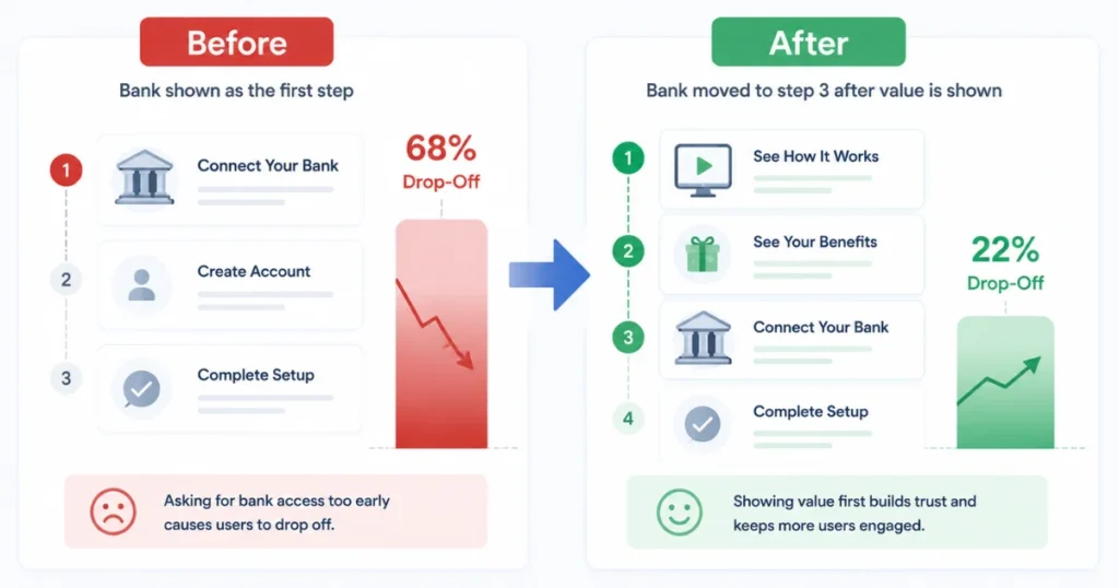
On a side project — a simple budgeting tool — I had a 3-step onboarding process that asked users to connect their bank account immediately after signing up.
It made total sense to me. Get them set up fast, right?
Wrong. My analytics showed 68% of people dropped off right there. Turns out asking someone to link their bank account before they’ve even seen the product feel trustworthy is a huge ask.
I moved that step after they’d explored a demo version with sample data. Drop-off went from 68% down to about 22%. Same feature, same product, completely different result — just because of when and how it was presented.
Common Mistakes I See (Because I Made Almost All of Them)
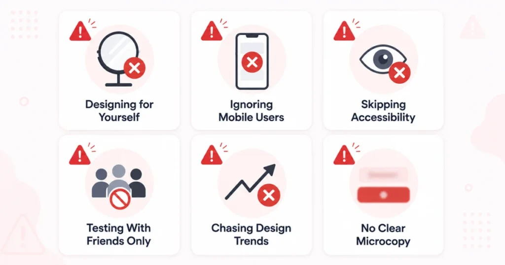
I Have Learned From My Mistakes.
I used to think that I was just like the people I was designing things for.
That is not true. I am not the person I am designing for. My ideas and tastes are not what everyone else likes. I know a lot about technology and I use things in a way that most people do.
I made things that I wanted, not things that the people I was designing for needed.
For example I spent a lot of time making a counter that was supposed to be fun but it turned out that nobody really wanted it. Design is not just about making things look different. Sometimes it is about changing the way things work like the order in which things happen.
Ignoring mobile users.
When you are making a product that people use on their computers a lot of people in the United States are probably using it on their devices instead. If your product does not work well on devices you are losing users of your product right from the start. This is because users of your product are trying to access your service on their devices and it is not working properly. Your product needs to be good, on devices or users of your product will go away.
Skipping accessibility.
Small font size, bad color contrast, and lack of image alt text are some examples of things that make your product inaccessible to many. Making your product accessible does not require much effort, but it can significantly impact the number of users who can utilize your service.
Testing only with your friends and family.
They are not good at giving opinions about your product because they are biased. User testing platforms, like TryMyUI or UserTesting are better. These platforms have users who will tell you what they really think about your product. You get feedback from these users about your product. This is very helpful because you want to know what real users think about your product.
Chasing trends.
Some of the worst design mistakes that I made were trying to implement neuromorphism, glass blur, and other trends that had nothing to do with the user experience. I was so busy trying to make my product look cool and up to date that I forgot about the user experience. My product ended up being really hard to use. It did not have a clear call to action. I mean the call to action was not easy to find, which is a problem for my product and the user experience of my product was not good.
Not designing microcopy.
Microcopy is one of those things that most people do not consider when designing a product. However, it plays a critical role in the user experience. That is why it is essential to invest time in designing the microcopy for your product. For instance, most people forget that buttons need to have a clear call to action. A CTA like Submit is much better than something generic like Action.
Read More: Ebooks: Why I Changed, What I Discovered and What I Wish Someone Had Told Me Earlier
Tools That Actually Made My Design Process Better
I’m not sponsored by any of these, just sharing what’s genuinely in my regular workflow:
- Figma – for wireframes, prototypes, and final UI design, plus easy collaboration with developers
- Notion – for keeping user research notes and feedback organized in one place
- Hotjar – for heatmaps and session recordings to see real behavior
- Maze – for quick, structured usability testing without needing to recruit testers manually
- Google Analytics / GA4 – for tracking where users actually go and where they leave
- Webflow – for building and launching marketing sites or landing pages fast without heavy dev work
- Canva – honestly still useful for quick social assets and simple graphics when I don’t need full design precision
Final thoughts
Looking back on it, I would not be ashamed about the failed project several years ago. It was a valuable experience for me; I learned a lot about the true nature of the product design process.
To my mind, design thinking never means the ability to distinguish good from bad taste. Rather, it usually implies the willingness to learn from one’s mistakes and the humility to understand that the product design process should always be guided by users’ behavior and not the other way around.
So, if you are working on the development of the new design, do not be afraid to seek feedback. Ask 5 different people to use your prototype and give you their opinion. I promise you that you would achieve much better results from observing real users’ actions within 20 minutes than trying to tweak a single color in figma.
Read More: Using AI to Create and Sell Digital Products (2026 Practical Guide)
FAQs
What are the top 5 digital products to sell?
Here are 5 solid ones for 2026: 1. Online courses/templates 2. Digital planners/printables 3. Stock assets 4. Software/SaaS tools 5. Ebooks/guides
How to become a digital product designer?
Study the principles of UX/UI — typography, design, color, and market research (you can start with Google UX Certificate or some simple YouTube tutorials). Learn Figma, Create a portfolio, Get the real feedback and experience.
Can ChatGPT create digital products?
Yes, it is capable of producing content such as e-books, templates, worksheets, and simple coding for easy applications. However, it does not deal with refined visuals and final packaging — hence you still need to supplement it with software like Canva or Figma.
How can I start digital products?
Choose a challenge that is easy for you to solve, be it a specific skill, design, or advice that people really need. Create it by utilizing platforms such as Canva, Notion, or Figma, and sell it through an easy-to-use platform like Gumroad, Etsy, or your own website. Start with one product, gather feedback from actual users, and make changes based on their input.
What are the top 10 digital products to sell in 2026?
Online courses/mini-courses 2. Notion/Canva templates 3. Digital planners & printables 4. Stock photos/videos/presets 5. Ebooks/guides 6. AI prompt packs 7. Website/UI templates 8. Chrome extensions/small SaaS tools 9. Fonts & icon sets 10. Email/social media content templates.
Can I use Canva and ChatGPT to make money?
Yes, You can use ChatGPT for content creation and Canva for making a visually-instagram-ready product. Sell through such platforms like Etsy, Gumroad and social networks like Instagram and Pinterest. It’s a low-budget technique adopted by many ideas for making money.
What is the easiest digital product to make?
Printables and templates (such as planners, checklists, or Notion templates) are the simplest products to create because they require no special skills in design or coding — just tools like Canva or Notion. One can complete this process in a couple of hours and offer ready-made products for sale through sites like Etsy or Gumroad.
What is the most demanding digital product?
Currently, online learning and AI-related instruments/messages are in high demand as consumers are willing to pay for acquiring knowledge and working with AI efficiently. A bit behind are SaaS tools and templates (Notion, automation workflows), which are fulfilling but less interesting than online learning. Every time, niche digital products that help solve customers’ problems outperform generic ones.