The first sales page I ever wrote for a digital product was three bullet points and a price.
Literally. Three bullets. A PayPal button. And a product title that was just the name of the file I’d created.
I listed it on Gumroad, shared the link once in a Facebook group, and then spent the next two weeks checking my email every twenty minutes for a sale notification that never came.
The product itself was actually good. A content calendar template that I’d built for my own blog and genuinely used every single week. The problem wasn’t the product. The problem was that my “sales page” gave nobody a single reason to buy it.
No headline that spoke to a pain point. No explanation of who it was for. No visuals showing what it looked like inside. Nothing that made someone feel like this would solve their problem.
That experience taught me something that changed how I approach selling digital products entirely: your sales page is your salesperson. It works while you sleep, while you’re at your day job, while you’re completely offline. And if it’s not doing its job, it doesn’t matter how good your product is.
Here’s what I’ve learned about building a sales page that actually converts — from someone who got it badly wrong first.
What a Sales Page Actually Is (and Isn’t)
A sales page is any page where someone decides whether to buy your product.
That could be your Gumroad product page. Your Etsy listing. A standalone page on your website built with Carrd, Notion, or Squarespace. Even a detailed Stan Store card.
What it’s not is just a description of what the product is. That’s the mistake most beginners make — they describe, they don’t sell.
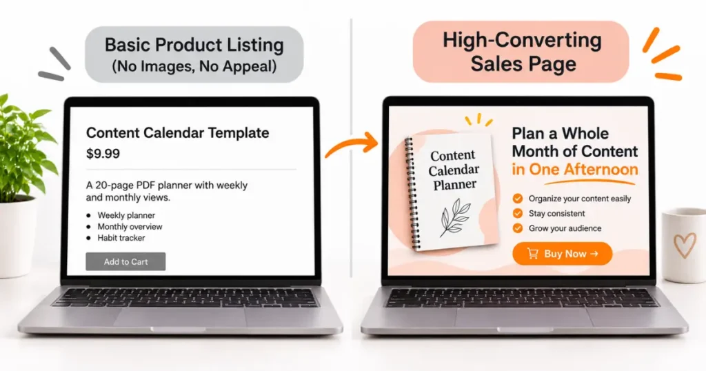
Describing: “This is a 20-page PDF planner with weekly and monthly views.” Selling: “Never lose track of your content ideas again — this planner keeps every blog post, caption, and campaign in one place so you can batch your whole week in under an hour.”
Same product. Completely different energy.
The goal of a good sales page is to do three things, in order:
- Make the right person immediately recognize themselves
- Help them see how your product solves their specific problem
- Make it easy and low-risk to click buy
That’s it. You’re not trying to trick anyone. You’re trying to help the right person say “yes.”
The Anatomy of a Sales Page That Converts
Let’s walk through every section you need, in order, with the why behind each one.
Section 1: The Headline
This is the most important line you’ll write. It’s the first thing people read, and it determines whether they keep reading or click away.
A great headline does one of these things:
- Names the exact person it’s for and the result they’ll get
- Calls out the problem they’re currently experiencing
- Makes a specific, believable promise
Weak headline: “Content Calendar Template for Bloggers” Stronger headline: “Plan a Whole Month of Content in One Afternoon — Even If You’re Always Starting From Scratch”
The stronger version speaks to a feeling a blogger knows well (always scrambling, never ahead). It makes the product feel like relief, not just a tool.
Spend more time on your headline than any other part of the page. Write 10 options. Read them out loud. Pick the one that makes you feel something.
Section 2: The Problem Paragraph
Right after your headline, name the problem your buyer is living with before they found your product.
This isn’t about being dramatic. It’s about showing the reader that you understand where they are. When someone reads something that describes their exact frustration, they lean in.
One paragraph is enough. Keep it honest, keep it specific.
Example: “If you spend more time staring at a blank content plan than actually creating — you’re not alone. Most bloggers and creators I know are stuck in reactive mode, posting when inspiration hits and going silent when it doesn’t. It’s exhausting. And it makes growth feel like a guessing game.”
The person reading that either says “yes, that’s me” (great — keep reading) or “not really my situation” (fine — they weren’t your buyer anyway).
Section 3: What It Is and What’s Inside
Now you can describe the product — but frame everything around what the buyer gets, not what the product contains.
Instead of:
- 20-page PDF
- Weekly view template
- Monthly overview section
- Habit tracker page
Try:
- A weekly layout that shows your whole content week at a glance — posts, captions, emails, all in one view
- A monthly planning page so you can map out campaigns before the month starts instead of scrambling mid-week
- A habit tracker section so you can build the daily rituals that make consistent creation actually possible
Same features. But now each one connects to an outcome the buyer actually wants.
Section 4: Who It’s For (and Who It’s Not For)
This one feels counterintuitive, but calling out exactly who your product is not for actually increases conversions.
It builds trust. It signals that you’re confident enough in your offer to filter people out. And it helps the right buyer feel even more certain that this was made for them.
Example: “This template is perfect for bloggers, content creators, and virtual assistants who manage content for clients. It’s not designed for large marketing teams or agencies — it’s a personal tool for solo creators who want to get organized fast.”
Short. Specific. Honest.
Section 5: Visuals and Mockups
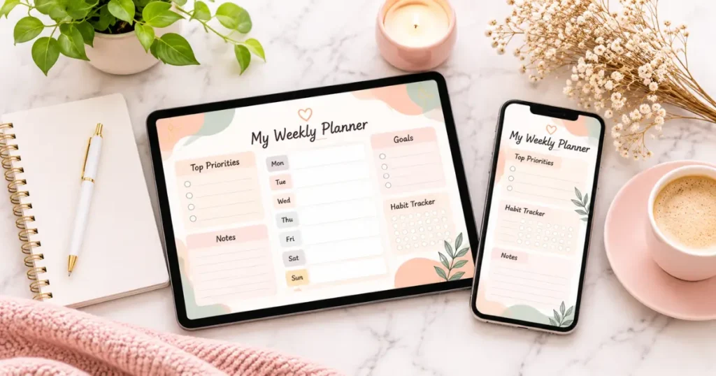
People cannot touch or open your product before they buy it. Your images are the closest thing to a free trial.
This is where most digital product sellers leave money on the table — they screenshot the product and slap it on the page. That’s not enough.
What actually works:
- A lifestyle mockup showing the product on a tablet, phone, or printed out (use Smartmockups or Anthony Boyd’s free mockups — both are excellent)
- A close-up screenshot of the most valuable or visually impressive part
- A “what’s inside” image that shows the structure or layout at a glance
Canva has built-in mockup tools now too. You don’t need Photoshop or design experience to make your product look genuinely professional.
One strong mockup image can do more for your conversion rate than three paragraphs of copy. Invest the time here.
Section 6: Social Proof
Reviews, testimonials, screenshots — if you have them, use them.
If you’re brand new and have zero reviews, here’s what you can do instead:
- Offer your product to 3–5 people for free in exchange for honest feedback, then quote their response (with permission)
- Share your own results using the product — “I used this exact template to plan 60 days of content in a single Sunday”
- Show your download numbers once you start selling (“Downloaded by 200+ creators”)
As you grow, reviews become your most powerful sales tool. Make it easy for buyers to leave them — on Etsy it happens automatically, on Gumroad you have to ask.
Section 7: Price and Call to Action
The price should never be hidden or buried. State it clearly, right before the buy button, with confidence.
If you’ve built the case for your product through everything above, the price should feel like a relief, not a shock.
Your call-to-action (CTA) button copy matters more than you’d think. “Buy Now” is fine. But “Get Instant Access” or “Download Your Template” feels less like spending money and more like solving a problem. Test what resonates.
One CTA at the top. One at the bottom. That’s all you need.
For help figuring out what to actually charge, my post on How to Price Your Digital Products walks through the full strategy — including how to test pricing and when to raise it.
Section 8: FAQ or Objection Busting
Before someone clicks buy, there’s usually a question holding them back:
“Will this work for Mac?” “Can I edit this in Canva?” “What if I already use a different system?” “Is this a one-time purchase or subscription?”
A short FAQ section at the bottom of your page answers these before they become a reason to leave. Three to five questions is plenty.
Think about every question you’ve ever been asked about your product — in DMs, in Facebook groups, in Etsy messages. Those are your FAQ answers.
Which Platform Should You Build Your Sales Page On?

This depends on where you’re selling:
Etsy — Your product listing is your sales page. The first image, title, and description are everything. The good news: Etsy sends its own traffic, so your page just needs to convert the buyers Etsy sends you. I go deep on listing optimization in Etsy SEO Tips for Digital Products That Rank Fast.
Gumroad — Gives you a simple but clean product page. You can add images, a full description, sections, and even a preview. It’s not fancy, but it’s enough. Focus on your copy and images.
Your own website (WordPress, Squarespace, Webflow, Carrd) — Maximum control, maximum work. Great for building long-term authority and capturing email leads alongside the sale. If you’re selling multiple products or building a real brand, this is worth doing eventually.
Stan Store / Beacons — Good for creators who already have a social media following and want a simple link-in-bio shop. Less discoverability through search, but quick to set up.
Payhip — Underrated. Free plan available, good built-in features, and you can design a reasonable product page without any coding.
For a full side-by-side comparison, Best Platforms to Sell Digital Products (Compared) breaks down the fees, features, and who each platform suits best.
Mistakes That Kill Sales Page Conversions
I’ve made these, watched others make these, and seen them in almost every “why isn’t my product selling?” post in Facebook groups.
Writing for yourself, not your buyer. Your buyer doesn’t care that the template “took you 40 hours to make.” They care what it does for them. Every sentence should answer “so what does this mean for me?”
Using the product file name as the title. “Content_Calendar_V3_FINAL.pdf” is not a product name. Write a title that sounds like something your buyer would actually search for.
No images, or low-quality images. A bad screenshot does more damage than no image. Invest an hour in a proper mockup. It makes a bigger difference than almost anything else.
Walls of text. Short paragraphs. Bullet points for features. White space is your friend. If your page looks like a legal document, people will bounce.
Burying the price or the buy button. Don’t make people scroll to find out how to buy. Put a CTA near the top and again at the bottom.
Forgetting to update the page. If you add new features, update the template, or change the format — update your sales page. An outdated description creates buyer confusion and refund requests.
A Simple Checklist Before You Publish
Run through this before your page goes live:
- Headline speaks directly to a pain point or outcome
- First paragraph names the problem the buyer is experiencing
- Product described in terms of benefits, not just features
- “Who it’s for” section is clear and specific
- At least one strong mockup image included
- Social proof present (or placeholder plan in place)
- Price is clearly stated near the buy button
- CTA button copy is action-oriented
- Short FAQ section answers the top 3–5 questions
- Mobile view checked — does it still look clean on a phone?
That last one matters. Most Etsy and Gumroad buyers are shopping on their phones. A page that looks great on desktop but breaks on mobile is quietly losing you sales.

A good sales page doesn’t have to be long, fancy, or written by a professional copywriter. It just has to make the right person feel seen, understand what they’re getting, and feel comfortable clicking buy.
The version you write today won’t be perfect. That’s fine. Publish it, watch how people interact with it, and improve from there.
The goal isn’t a perfect sales page — it’s a published one that you keep making better.
And if you haven’t decided what to sell yet, Digital Product Ideas That Sell Without a Big Audience is a good place to start building your product idea. Then come back here and build the page that sells it.
Frequently Asked Questions
1. How long should a sales page for a digital product be?
Long enough to answer every question a buyer might have, short enough that they don’t get bored before reaching the buy button. For a simple template or ebook, 400–800 words of copy plus strong visuals is usually enough. A course or higher-ticket product might need a longer page. Let the product’s complexity and price point guide the length.
2. Do I need a website to create a sales page for my digital product?
No. Platforms like Gumroad, Payhip, and Etsy all give you a product page as part of their free setup. You can build a converting sales page entirely within those platforms without owning a website. A personal website becomes more important as you grow, but it’s not a starting requirement.
3. What should I put in the product description on Etsy?
On Etsy, your description is your sales page. Lead with the buyer’s pain point, explain what they get and how it helps them, include practical details (file format, what software they need, how to access it), and end with a brief FAQ. The first 160 characters matter most because that’s what shows before the “read more” cutoff.
4. How do I write a headline if I’m not a copywriter?
Use this formula: [Specific result] + [timeframe or ease] + [for who]. Example: “Plan a Month of Social Media Content in One Weekend — Template for Busy Creators.” It’s not fancy, but it’s clear and specific. Clarity beats cleverness on a sales page every time.
5. Should I include a money-back guarantee on my digital product sales page?
If you’re selling on your own site, a simple 7-day “if you’re not happy, reach out” policy can increase buyer confidence. On Etsy, digital downloads don’t typically support returns (since the file can’t be “returned”), but Etsy’s policies handle disputes — you don’t need to promise refunds explicitly.
6. How many images should I include on my sales page?
For Etsy listings, use all 10 image slots if possible — cover mockup, inside views, feature highlights, “who it’s for” text graphic, and a lifestyle image. For Gumroad or your own site, 3–5 strong images is usually enough. Quality over quantity — one great mockup beats five bad screenshots.
7. What tools can I use to create product mockups for free?
Smartmockups has a free tier with device and stationery mockups. Canva now has built-in mockup tools in the design editor. Anthony Boyd Graphics offers free high-quality mockup PSD files. For a no-design approach, Placeit has a large library though it’s subscription-based.
8. How do I know if my sales page is working?
Track your conversion rate — the percentage of page visitors who buy. On Etsy you can see views vs. sales in your shop stats. On Gumroad you can see page views. If your conversion rate is under 1%, something on the page isn’t connecting — usually the headline, the images, or the lack of clear benefit framing. Tweak one element at a time.
9. Can I use AI to help write my sales page copy?
Yes — tools like ChatGPT are genuinely useful for drafting headline options, benefit bullets, and FAQ answers. Give it your product details and your target audience and ask it to write 10 headline variations or 5 ways to describe the main benefit. Use it as a starting draft, then rewrite in your own voice. I cover how I use AI for content creation in Using AI to Create and Sell Digital Products.
10. My product is on Etsy but not getting sales — is it the sales page or the SEO?
Often both. First, check your views. If you’re getting very few views (under 50 in 30 days), the problem is SEO — people aren’t finding your listing. If you’re getting views but no sales, the problem is the listing itself — your images, title, description, or price isn’t converting. Fix discoverability first, then optimize conversion. Etsy SEO Tips for Digital Products That Rank Fast is the best place to start on the discovery side.